Asymmetrical design might sound like a fancy term thrown around at art galleries, but it’s so much more than that. Imagine a world where balance takes a backseat, and creativity runs wild. This design style challenges the norm, creating visual intrigue that keeps eyes glued and minds engaged. It’s like a rebellious teenager who decides to wear mismatched socks and somehow pulls it off flawlessly.
Understanding Asymmetrical Design
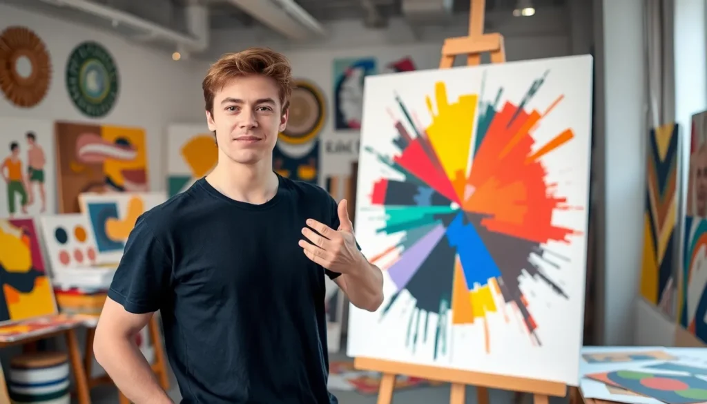
Asymmetrical design emphasizes visual interest over traditional balance, capturing attention through intentional imbalance. This creative style resonates with those seeking to push boundaries and explore unique aesthetics.
Definition and Key Principles
Asymmetrical design involves arranging elements of varying weights and sizes to create visual harmony without symmetry. Key principles include contrast and visual hierarchy. Designers often balance elements using color, shape, and texture rather than aligning them evenly. Tension between shapes can energize compositions. Emphasis on focal points encourages viewers to engage with designs. Additionally, the unexpected nature of asymmetry invites exploration, prompting deeper connections with the design.
Historical Context
Asymmetrical design gained traction in the early 20th century, particularly with the rise of modern art and movements like Bauhaus. Artists and designers, such as Wassily Kandinsky and El Lissitzky, embraced the departure from traditional design norms. The shift reflected a cultural desire for innovation and individuality following World War I. This approach continued to evolve, influencing graphic design, architecture, and product design into the late 20th century. Digital design further accelerated asymmetric trends, allowing for dynamic and interactive experiences. As a result, asymmetrical design remains relevant in contemporary aesthetics.
Benefits of Asymmetrical Design
Asymmetrical design offers unique advantages that contribute to its growing popularity. Designers highlight its capacity to create striking visuals and improve user experiences.
Aesthetic Appeal
Asymmetrical design captivates the eye with its unconventional layout. Unexpected arrangements draw attention, fostering a sense of intrigue. Unique compositions challenge traditional norms, allowing creativity to flourish. Strong contrasts between elements enhance visual stimulation, making designs memorable. Color, shape, and texture variations play crucial roles in creating this captivating aesthetic. Users often find themselves engaged longer with asymmetrical visuals than symmetrical ones.
Enhanced Functionality
Asymmetrical design enhances functionality through intuitive layouts. Designers can emphasize key information, guiding users’ focus where it matters most. Clear visual hierarchies emerge, directing attention without overwhelming. Flexible arrangements adapt well to different screen sizes, ensuring responsiveness in various contexts. Functionality improves as designers prioritize usability and coherent navigation. Engaging asymmetrical designs often lead to better user interactions and increased satisfaction.
Common Applications of Asymmetrical Design
Asymmetrical design appears across various fields, enhancing visual appeal and functionality. This design approach thrives in distinct areas such as architecture, graphic design, and product design.
Architecture
Asymmetry plays a crucial role in modern architecture. Unique building shapes and unexpected arrangements often create striking visual landmarks. Notable examples include the Guggenheim Museum in Bilbao, which showcases complex curves and unconventional forms. Architects balance diverse materials and textures, allowing light to interact dynamically with structures. This intentional imbalance fosters harmony, inviting exploration and interaction with spaces.
Graphic Design
Graphic design leverages asymmetry to captivate viewers. Designers frequently employ uneven layouts to create striking advertisements and website interfaces. This technique enhances message conveyance by emphasizing key elements, drawing focus where desired. Contrasts in typography and imagery lead to memorable compositions. By integrating asymmetrical grids and diverse visual hierarchies, graphic designers engage audiences while conveying uniqueness and innovation.
Product Design
In product design, asymmetry enhances functionality and aesthetics. Consumer products often feature unexpected shapes that stand out on shelves. Electronic devices utilize asymmetrical elements to improve ergonomics and usability. Designers create intuitive user experiences by positioning controls in easily accessible spots. This blend of form and function not only attracts attention but increases user satisfaction and interaction.
Challenges in Asymmetrical Design
Asymmetrical design poses distinct challenges that can impact its effectiveness. Understanding these challenges can help designers create compelling work.
Balancing Elements
Balancing elements in asymmetrical design involves careful consideration of weight and distribution. Designers often find arranging diverse shapes, colors, and textures difficult. Without traditional symmetry, the challenge lies in maintaining visual interest while achieving a sense of equilibrium. Weights must counteract each other, often requiring multiple iterations to obtain the right feel. Each element interacts with others; thus, adjustments can lead to unexpected results. Designers must assess how variations in scale, color, and placement affect overall harmony. Mastery of these techniques results in striking compositions that captivate viewers while avoiding chaos.
User Perception
User perception plays a critical role in the success of asymmetrical design. Designers face the task of ensuring viewers understand the intended message amidst visual complexity. Asymmetrical layouts can evoke ambivalence or confusion if mismanaged. Attention must be directed towards primary elements, guiding users through the design smoothly. A well-structured composition helps viewers navigate information intuitively. The emotional response elicited by the imbalance also influences engagement. Stronger visual hierarchies often lead to improved user satisfaction and retention, emphasizing the importance of strategic design choices.